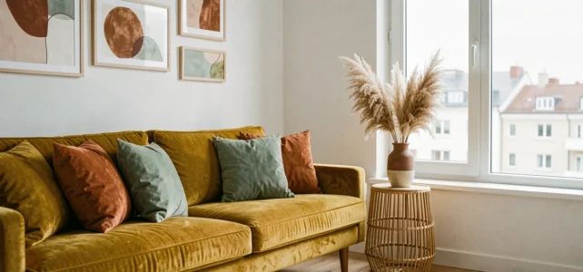
Dopaminergic decoration is not just about placing a yellow cushion on a gray sofa. It involves choices of saturation, color distribution, and contrast that, if poorly managed, produce an exhausting rather than stimulating interior. We have observed a clear shift from neutral palettes to bold, flat colors over the past two seasons, and this transition requires a method.
Saturation and color temperature: the technical parameters of a dopaminergic palette
The principle of dopaminergic decoration relies on the use of highly saturated hues (cobalt blue, electric magenta, saffron yellow) to stimulate energy and self-expression. The break from all-white or all-beige, described by TF1 Info as a conscious reaction against walls deemed “clinical,” requires understanding two parameters before choosing a paint pot.
The first is the actual saturation of the pigment. A bright color in a swatch loses its intensity once applied to a large surface, especially under warm artificial lighting. We recommend systematically testing a sample of at least 50 x 50 cm on the targeted wall, observed at different times of the day.
The second parameter is the color temperature of the lighting. Saffron yellow under a 2,700 K bulb turns orange. Under 4,000 K, it retains its brightness but may appear acidic. The agreement between wall hue and lighting temperature conditions the entire result. Ignoring this point is akin to choosing a color blindly.
To explore decorative pieces that leverage these saturated palettes, brands like Nananere Déco offer ranges designed around this vibrant chromatic logic.
Warm colors in decorative objects: burgundy, gold, and brown as colorful accents
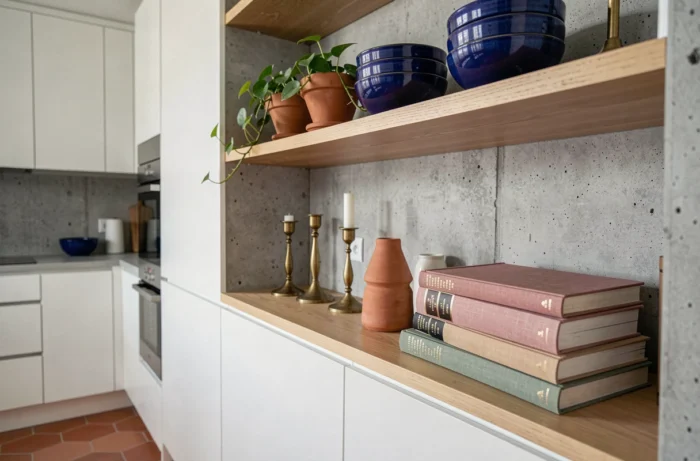
Data from second-hand platforms confirm a marked increase in searches related to warm and rich colors: brown, gold, burgundy. These are no longer niche hues. They function as accents in an already colorful interior or as anchor points in a room with neutral walls that one wants to warm up without repainting everything.
Burgundy as a decorative object structures a room better than bright red. Its depth absorbs light instead of reflecting it, which avoids the “advancing wall” effect of saturated reds. In a vase, on table linens, or as a lampshade, it adds visual weight without overwhelming the space.
Gold, used in a matte finish rather than shiny, creates a contrast of texture more than a contrast of color. On a frame, a lamp base, or a furniture handle, it interacts with browns and burgundies without falling into gaudiness. The rule we apply: limit golden touches to two or three objects per room to maintain a subtle effect.
Combining warm accents and bright walls
The layering of patterns and contrasting textures, characteristic of the bold return of maximalism, only works if one prioritizes visual planes. A cobalt blue wall with burgundy cushions and a gold light fixture produces a coherent effect as long as a neutral surface (light floor, white ceiling) is reserved to allow the whole to breathe.
Without this breathing space, the chromatic accumulation tires the eye in just a few minutes. Successful maximalism is not the absence of rules; it is a rule of proportion applied rigorously.
Eco-friendly paints and bright colors: real compatibility
The enthusiasm for intense colors faces a technical constraint that few mainstream articles mention: low-VOC paints offer a more limited range of pigments. Certifications like the Blue Angel impose strict thresholds on volatile organic compounds, which limits certain binders and pigments traditionally used to achieve highly saturated hues.
This does not mean that eco-friendly paint cannot be bright. Manufacturers have made progress, and bio-based formulations using linseed oil or plant resins now achieve convincing saturation levels in most shades. Two exceptions remain:
- Very intense reds and oranges, which require cadmium pigments or concentrated iron oxides, remain more difficult to formulate without petrochemical solvents.
- Deep matte blacks, often achieved with carbon black, raise questions about coverage in a single coat with current eco-friendly formulations.
- Ultramarine blues and emerald greens can be obtained easily with mineral pigments compatible with environmental labels.
We recommend checking the manufacturer’s technical data sheet, particularly the VOC content in g/L and the type of pigment used, before approving an intense color for a large living area.
Colorful decoration by room: adapting the palette to function
Applying the same chromatic logic in a bedroom and in a kitchen produces opposite results. The psychology of colors applied to interior design, documented by several universities, shows that warm hues stimulate appetite and conversation, while blues and greens promote concentration and rest.
Kitchen and dining room
Saffron yellow or terracotta on a wall, combined with brown or gold accessories, energizes the dining space. The kitchen tolerates stronger contrasts better because the time spent there is fragmented: you enter, cook, and leave. The eye does not have time to tire.
Bedroom and library
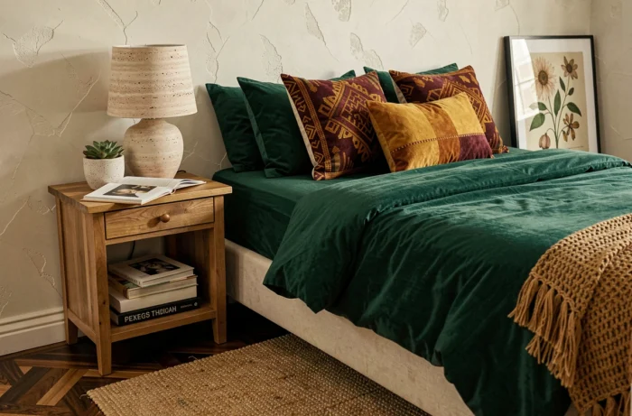
Deep burgundy or old rose function as soothing envelopes. In a library, a celadon green on the shelves creates a backdrop that highlights the book spines without overwhelming them. A common mistake is to saturate these restful spaces with overly bright hues in the belief that it adds personality. The result is a space where one struggles to relax.
- For the bedroom: prioritize desaturated colors on the walls and reserve brightness for bedding or frames.
- For the living room: a saturated accent wall works if the other three remain neutral or in a softened complementary tone.
- For the indoor garden or veranda: bright greens and vibrant yellows amplify natural light without the need for lighting correction.
A colorful and trendy interior is not built by accumulating trendy hues. It is built through arbitration: choosing where color acts, where it recedes, and ensuring that the available light in each room supports the chosen pigment rather than betraying it.